


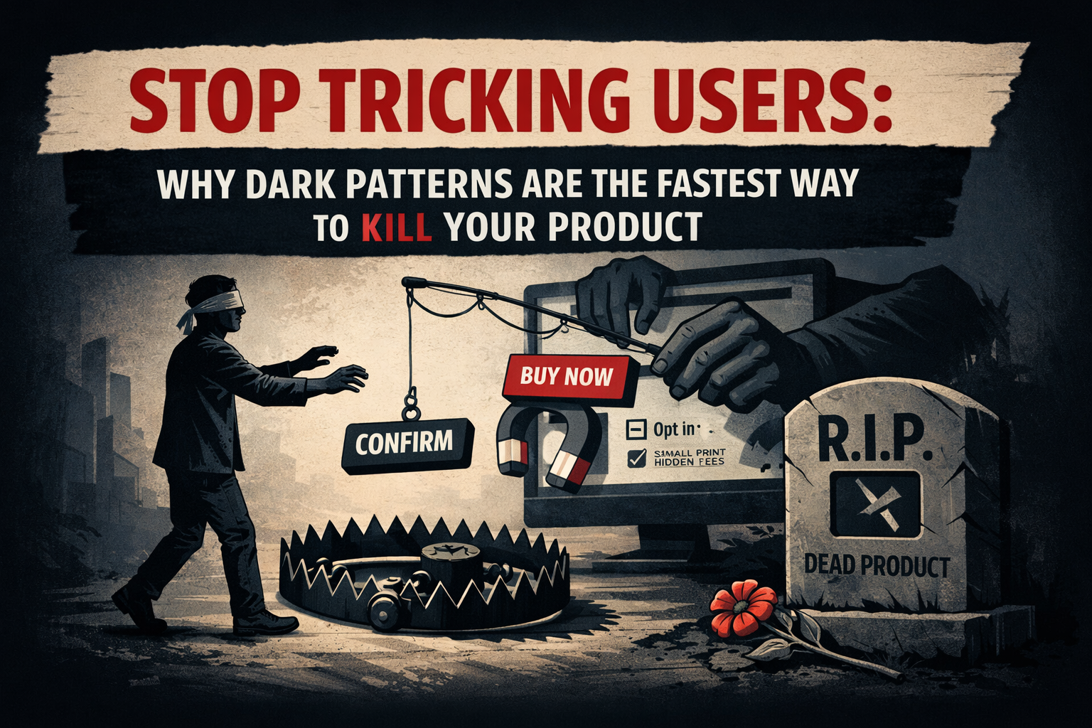
TL;DR
People are constantly tricked by Dark Patterns and fake product tests, and they’re now fighting back with boycotts, lawsuits, and public exposure. If you want to stop tricking users and build long-term growth, following ethical validation steps will put you ahead of the competition:
1. Define your validation goal: engagement, subscribers, or customers.
2. Be transparent: explain what you’re building and why users should join.
3. Show real progress and get consent before using users as test subjects.
4. Follow basic ethical values: honesty, privacy, safety, respect, usability.
5. Test and improve: ethical design builds trust and long-term customers.
If you would like to learn more about these steps, with a specific use case example, read on…
User Manipulation by Businesses
Have you as a user gone to your favourite social, shopping, or entertainment platform to browse some products or solutions? You are greeted with a message: subscribe now and get one month free. A second thought comes to your mind: can I cancel easily, are there hidden fees, markups on products, late cancellation penalties, would my data be used or sold without consent, and who knows what it might be used for? Similar practices can be seen in addictive mobile games too. If you have experienced any of these, you are not alone, and these happen on a regular basis—you have been exposed to some of the Dark Patterns (also Deceptive Patterns) in Design.
In another occasion you would see an ad for a new game, movie, tech, or a toy you would like to have, just to find out that it does not even exist. You probably have seen the “Waitlist” option when sharing your email with a company: when a “Buy Now” button leads to an “Oops, we’re not ready yet!” page. Yes, in that case, you have seen a fake ad, also called a product validation test or a smoke test.
Users Traped by a Deceptive Design
In the above occasions you as a user were a victim of a non-ethical design of a consumer product, service, or design validation process, part of a Commercial Deception to get your data about your intent and interest in a certain product. Companies are making marketing materials to try out things that don’t exist yet and now, especially with AI-generated content, this is becoming even more alarming.
Here is the truth: users don’t want their time wasted, their data stolen, or their hard-earned money taken with nothing in return. Users have had enough of that and they are waking up; they have become savvy about spotting whether they have been part of a smoke test or not and are vocal about it. They share their experiences on platforms like Reddit, ways to be alert, or how to be safe, filing lawsuits, blacklisting companies, and transitioning to better businesses. We live in a world where our data has become much more valuable and new laws in many countries in the EU and also in the US forbid the use of such tactics, which can cost companies a lot in fighting legal battles.
How to Stop Tricking Users and Design Ethically
If you are building a new product or starting a business, you might need to think again on your approach to designing your product, testing user engagement or drive your revenue.
Steps how to design and validate in an ethical way:
1. Start with what is your goal in the validation process. Do you want to gather engagement data, get subscribers or even customers? This will drive the design and user testing decisions later on.
2. Design and plan with transparency in mind. If you want to build a waiting list – then clearly state: “We are building this, which solves x, y, z. It is not ready yet, but if you are interested, subscribe to our waiting list and we will come back to you. You can see how following this simple way already tells the users what to expect, builds trust, and prevents any feeling of being misled.
3. Show a real progress towards the product in your marketing or webinar campaigns. No user wants to commit to something, which a company did not even want to build in the first place. Moreover, users are not your guinea pigs to test things on without asking for their consent. Such tests, user info and their time are all valuable and must be compensated at all times. Things you could do are: write posts, articles on your progress, arrange paid user tests or offer early users something valuable in return.
4. Follow ethical design practices. How do we know what’s ethical? Simply follow the common values in life: honesty, privacy, safety, respect, usability. In a simple way to say it – treat your customers well. Sometimes, we as designers might fall into a trap by looking at similar products and following them. That is why it is important to be familiar with good and bad design practices, laws, bad usability & UX, etc.
5. Test your approach – the more ethical your validation and design is, the more customers you will get in the long run.
Use Case Example: Free Guide Book – used as a Lead Magnet
We take a slightly more complex example here, since there is a very thin line between it being deceptive and being ethical. With this example, we have compiled a useful list of dos and don’ts for designing user engagement tests using a Lead Magnet approach.
What is a Lead Magnet: it is a valuable free offer (like an ebook, checklist, webinar, or discount) that businesses provide to potential customers in exchange for their contact information, usually an email address, to generate leads and nurture them into paying customers. It’s a key part of digital marketing, acting as a “bribe” or incentive to get someone interested in your brand to share their details, thereby entering your sales funnel. The user enters into a transaction where they give away something valuable for the company: name, age, gender, email, interests, etc., in order to obtain something they believe is valuable to them (in our example – this is the Free Guide Book).
The tricky part here is how the company presents this to the user, the company’s intent what they want to do with the user’s data and what the consequences for the user in the long run would be. If not done properly, this could quickly turn into a Dark Pattern, which can be costly for your business.
In our example, we will use a Free Guide Book in exchange of user’s email. Goal: the business wants to make a connection with the user and provide them with other benefits, be it articles, discounts, and of most importantly paid products and services.
How can we design such interaction properly?
1. The free guide must actually be valuable and not an AI generated bloat of known things and cliché. Also, all info about your offering should be clear to the user upfront.
- Do: Provide real valuable content, contents page, “Look Inside”, summary and what they will benefit from this guide.
- Don’t: Just use flashy, empty words: Get Your FREE guide; Become master in 24h with this guide, etc. Also make sure your free sample actually works or solves something for the user.
2. Email, name, phone, etc. entering field(s). This is the part when the company asks for the user’s info.
- Do: Provide clear info – for what exact purposes this data will be used, backed with your privacy policy and terms and conditions. Include zero party data sharing – meaning you clearly promise that the data is never going to be shared with third parties. It is also useful to display for what period of time the user’s data will be kept – something which also brings comfort for the user and not needing to remember to deal with that matter down the road.
- Don’t: Just ask for user’s email or even worse – make users believe the email will be used to send them the guide only. Everyone is tech savvy enough nowadays to know that it’s not complex to generate a download link to give users what they want.
3. Extra options around the transaction – checkboxes for newsletter, marketing materials, future promotions, new products announcements, etc.
- Do: Completely omit these if they are not part of what the users are here for. For example, in our case, the users want the guide, not to subscribe to your newsletter. However, if you must have something extra, it is advisable to leave these boxes unchecked, let the user select what they need. If you are concerned about user skipping or not seeing these make them into a few steps – these steps should be no more than 2 or 3 with clearly telling the users there are exactly these amount of steps upfront, easy to skip or go back to if needed.
- Don’t: Show users things they are not here for. Also do not make all boxes checked, with smaller font size, confusing or deceptive wording. Worse, don’t make it long so that users would just select those options instead of spending time reading through.
4. Every design should have option for the user to undo, or go back to the beginning from where they started. So when eventually you get to send the users back an email, providing ways for the user to undo or start over should be present.
- Do: Provide one click un-subscription of services, which user might have accidently accepted. Or a link to the site settings where they can delete their account if they wish so – it is also important that these settings are not buried or hard to find.
- Don’t: Hide this info from the users, nor using small fonts size or other tricks, to hide these options.
5. Make your Lead Magnet paid. Yes, paid – your goal with the lead magnet in this example is to get paying users, not any random user.
- Do: Make it paid, usually via small symbolic payment minimum 1 dollar. You could do it via targeting the exact high income users (a simple statement such as if you are a manager earning 15K a month, get your Guide for just $5 and unlock benefits worth far more…). The payment could also be backed by a discount or a small entering registration fee before getting the full service.
- Don’t: Always give away things for free – this most often would attract anyone, allows people to use fake or use secondary “spam” email addresses or sometimes even bots. Your data will be skewed anyway.
6. Give users way to evaluate your service before they fully commit. It is becoming more popular with younger generations on the internet, where they will demand a company offering a service to prove its value over time. They will do that before they even commit to it long term. Even if they do, they will be closely watching it. This means that a business can no longer rely on its first interaction via lead magnets anymore.
- Do: Provide money back guarantee, discount on next service or a free month. Continuously check on users if they are getting the experience they asked for.
- Don’t: Hide behind – this is our non-return policy or no money return policies. We all know these are made up terms that can change at any moment.
Conclusion
These are very small part of possible ways to keep your users feels safe and respected, but as you can see it is not complex to adhere to as long as your team has the right mind-set. Ethical design is no longer optional; it is the foundation of trust, loyalty, and sustainable growth. Build honestly, respect users, and your product will earn real engagement instead of forced attention.